DIY Visualisations with Gnuplot
Way way back when we did not have budget for profilers, but we had to do some stress / performance testing and do estimations. (Actually we’ve bought JProfiler license, but it was able to work only with 1 JVM).
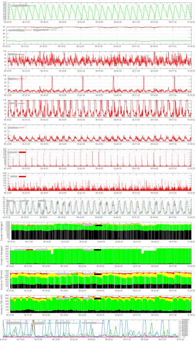
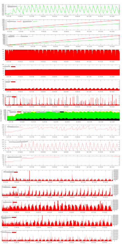
The goal was to measure the throughput of the system, duration of test cases, track zero-patient - who had caused issues with system.
So as everyone else did at the time, I wrote my own log collector with JSch & collected all possible logs from remote machines & started thinking about visualizations.
And they had to be manager-friendly. Not particulary an eyecatcher, but we had what we had.
Gnuplot
Great way to display information from multiple sources in one place - is to use Gnuplot’s multiplot mode, that allows to plot multiple graphs on one image. If they are synced by time properly - it is becoming easy to track source of issues.
Javascript
I don’t remember where I found this script, but it was a great tool to visualize duration of our test case steps.
Size of circle indicates duration in second.
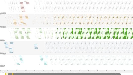
Ruby
This one visualized different steps of test with colors and mapped it to a X Axis.
As a result below we see result of execution of hundred of tests on Y axis.

Notice the increasing size of the line and empty parts - the connection pool & queue were full, so some of the test steps were not started / finished.